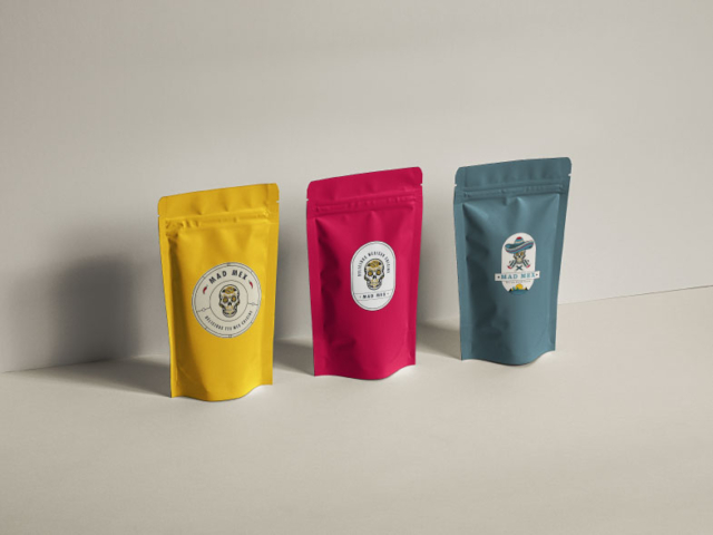
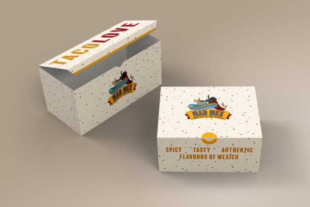
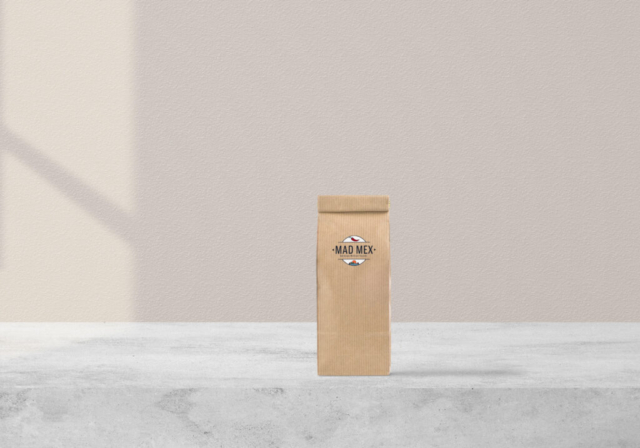
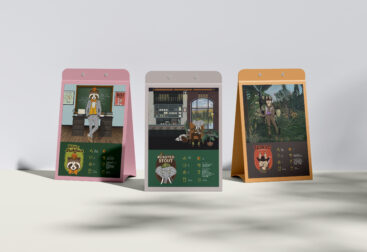
I have to say this one was pure fun! Usually I dont get to work with so many colors in a logo but the MadMex team was more than willing to just let me go crazy with color because lets be honest “Mexico without color is like pudding without sugar!”
Alright so the brief literally said bring the essence of Mexico by quick association. What better icon that the Spanish Calavera. When walking on a street with many food joints we wanted the hungry consumer to quickly identify a mexican restaurant.
Sharing many iterations that happened before we worked out a logo that included the type and form together.
Enjoy a little behind the scenes of with me.


